플렉스
→ 보통 1줄을 정렬할 때 사용
그리드
→ 보통 2줄 이상을 정렬할 때 사용
justify-content: space-evenly;
align-items: center;
content 는 여러줄에 대한 설정
items는 한줄에 대한 설정
.container {
border-width: 1px;
border-color: black;
border-style: solid;
display: flex;
height: 500px;
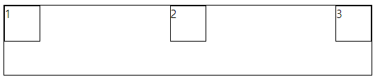
flex-direction: row-reverse;
justify-content: space-evenly;
align-items: center;
}
.item1 {
border-width: 1px;
border-color: black;
border-style: solid;
width: 50px;
height: 50px;
}
.item2 {
border-width: 1px;
border-color: black;
border-style: solid;
width: 50px;
height: 50px;
}
.item3 {
border-width: 1px;
border-color: black;
border-style: solid;
width: 50px;
height: 50px;
} <div class="container">
<div class="item1">1</div>
<div class="item1">2</div>
<div class="item1">3</div>
div.item3*10
</div>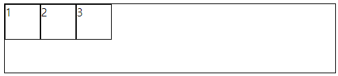
.container 수정
justify-content: center;
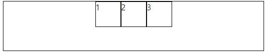
justify-content: flex-end;
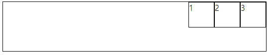
justify-content: space-around;
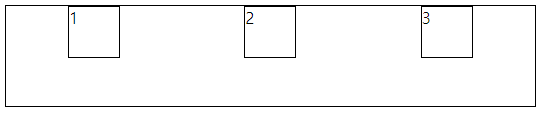
justify-content: space-between;
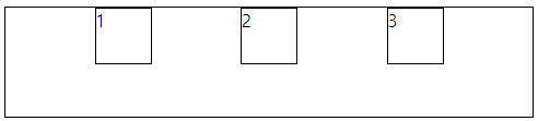
justify-content: space-evenly;
height: 500px;
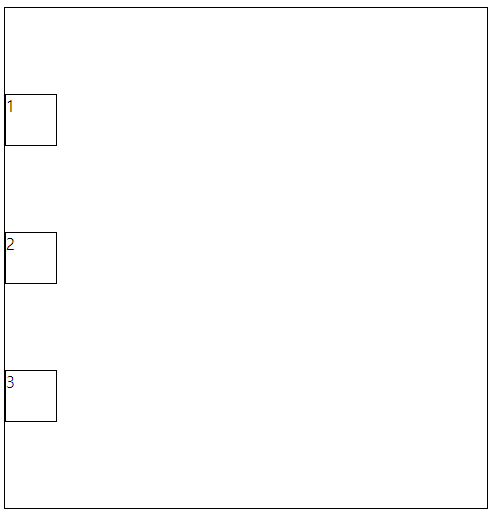
justify-content: space-between;
align-items: center;
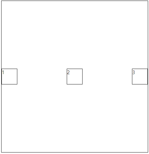
flex-direction: column;

flex-direction: column;
justify-content: space-evenly;
/* align-items: center; */
방향에 따라 justify-content와 align-items가 적용되는 부분이 달라진다.
flex-direction: row-reverse;
justify-content: space-evenly;
align-items: center;

item을 10개 추가후
flex-wrap: wrap;

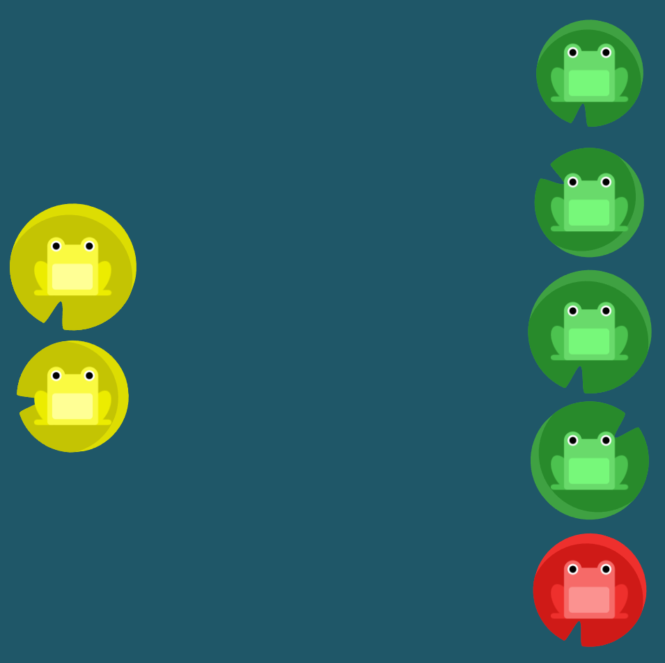
Flexbox Froggy
A game for learning CSS flexbox
flexboxfroggy.com
플렉스 연습 사이트

#pond {
	display: flex;
	flex-direction: column-reverse;
	flex-wrap: wrap-reverse;
	justify-content: center;
	align-content: space-between;
}
'프론트엔드 > html css' 카테고리의 다른 글
| 반응형 웹 (0) | 2023.06.27 |
|---|---|
| 토스 페이지 그려보기 (0) | 2023.06.26 |
| 그리드 연습 사이트 (0) | 2023.06.26 |
| 그리드 (0) | 2023.06.26 |
| 절대경로, 상대경로 (0) | 2023.06.26 |